
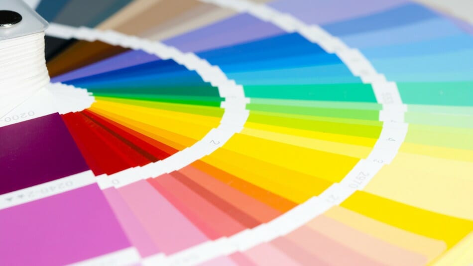
Are you looking to create a new look for your home, your art or your jewellery. Try grabbing a new palette of colors to play with – but how do you break from the same ones you always grab due to familiarity, ease and comfort? How do you jump into fresh green, purples, aqua or pink for the first time?
There is a very simple method:
Step 1 – find a painting you adore.
Step 2 – copy its color palette into your new creative plan.
Here are some examples of art recently featured in my blog. Amazingly you find colors which you have never imagined using and palette entirely different to your normal approach.
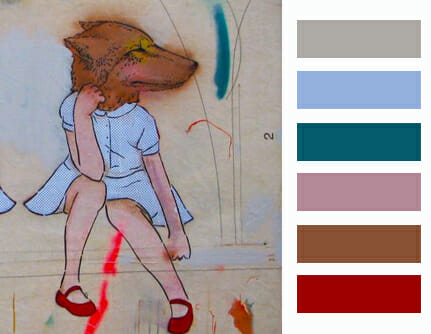
The nostalgic yet splashy colors of Amanda Marie
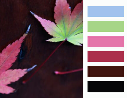
From my own photos of autumn leaves on the coffee table
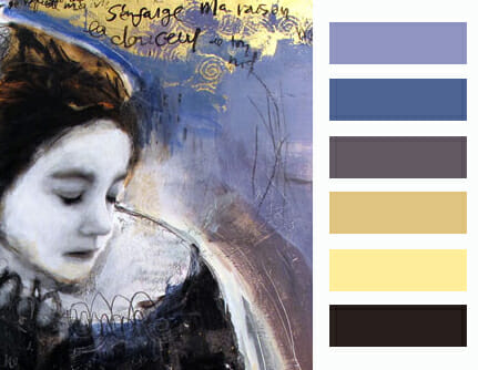
Subdued and comfortable tones of Dominique Fortin.

Fresh yet understated colors of street artist FinDAC.

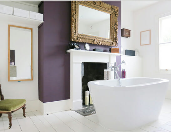
Energetic desert colors from Gloria Petyarre, central Australia.
The same palette of pink, orange, red, white and navy for a new fresh approach.
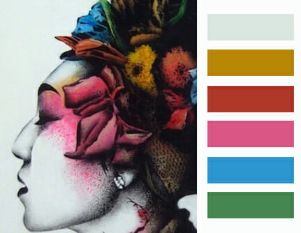
More nostalgia by Isadore Stowe
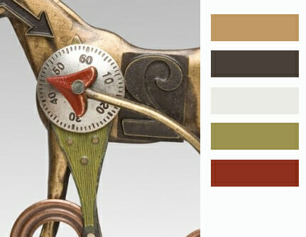
Heritage tones in this jewellery by Mianium.
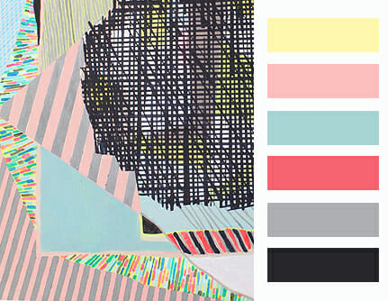
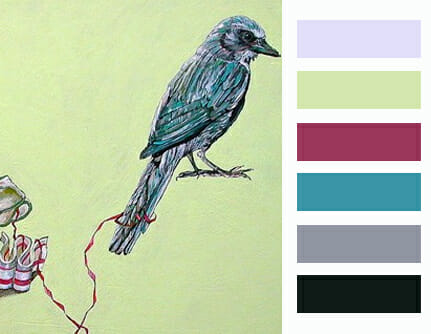
Fresh and delicious palette of Misato Suzuki
Maybe a little too fresh and delicious to live with …
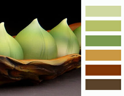
Earthy and edible from Andy Rogers.

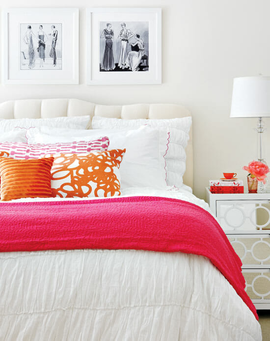
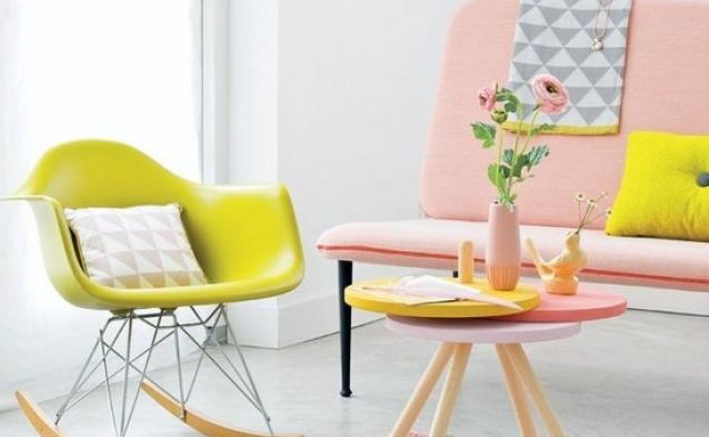
Same colors in this stunning lounge by Robert Brown.
Well that certainly gave me an insight into a whole new decorative approach as well at what colors have been capturing my line of sight over the past months. Its a neat trick to try out and find a new perspective of color to play with.
ALWAYS THE ARTIST
Dina